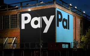
We’re excited to delve into PayPal’s recent rebrand. A successful transformation that retains its iconic styling whilst completely modernising the brand using a bold custom-font, colour blocking and harnessing simplicity. All of which we think are key trends and tips to deliver an ultra-modern brand identity.
Let’s explore the key elements that make this rebrand a noteworthy achievement.
A New Custom Typeface: PayPal Pro
One of the standout features of the rebrand is the introduction of PayPal Pro, a bespoke typeface that merges functionality with personality. Inspired by the classic Futura and customised from LL Supreme, PayPal Pro embodies the brand’s commitment to prioritising simplicity. One of the stand out factors for us is removing the slight italic slant, now that they’ve made this change and you see them side by side (as below), you can see just how dated the slanted effect can make a logo feel.

Credit to Fintec Branding Studio for the image utilised above.
Logo Evolution: Recognisable, Yet Impactful
PayPal’s iconic double ‘P’ monogram has undergone a thoughtful refinement. With sharper, cleaner lines and enhanced contrast in the overlapping blues, the logo feels fresher while maintaining its recognisable silhouette. The separation of the logo and word mark provides greater flexibility for usage across various platforms, ensuring that the brand remains adaptable without losing its essence. This balance between familiarity and modernisation is a hallmark of effective rebranding.
Refined Colour Palette: Washing out Dated Blues
The updated colour palette sees PayPal’s signature blues fine-tuned. Their previous richer blue has been refined ever so slightly whilst adding in a very modern light blue to the mix. This ensures that they move away from the dated effect that the traditional rich blue can give off. We also see black become more prominent, previously the use of this has been kept very minimal. Overall the tweaks wash out any dated-blues and produce a minimalistic feel which still retains brand identification.
Dynamic Motion Language for Digital Interactions
In an era where user experience is paramount, PayPal has introduced a new motion language that mirrors common interactions like tapping, swiping, and flipping. This kind of software is most commonly seen in cars where you can turn up the volume or change the song by using hand gestures. This novel addition reinforces PayPals commitment to be seen as a leader in tech as well as financial services. We feel that like the addition of the light blue, this technology also infuses a sense of playfulness into the brand.
Collaborative Effort: From Concept to Launch
The rebrand was a collaborative effort, spearheaded by PayPal’s internal teams and the renowned design firm Pentagram. This partnership ensured that the rebrand aligned with the company’s strategic goals while capturing the essence of the brand. The global launch campaign, featuring actor Will Ferrell, highlighted PayPal’s refreshed identity in a fun and approachable manner, successfully showcasing the brand’s playful side.
Conclusion
PayPal’s rebrand stands as a testament to the power of keeping branding up to date. As we compare the old to new it really highlights just how dated the previous branding was, especially rhe royal blue in the logo and the italic slant on the font.
By modernising its visual identity while retaining its iconic elements, PayPal has not only enhanced its brand presence but also reaffirmed its commitment to making financial transactions accessible and straightforward. At Invo Design, we believe this rebrand sets a benchmark for how brands can evolve without losing sight of their core identity. As PayPal continues to innovate, we look forward to seeing how this fresh identity will resonate with users around the globe.


